
Dark mode changes the interface around social content, usually using light text on a dark background. For a brand, the practical question is whether its posts, logos and destinations remain readable in that environment. A darker interface does not by itself prove higher engagement, better sleep or improved health.
Respect a preference without assuming one experience
People use different screens, lighting conditions and accessibility settings. Some prefer a dark theme; others read more comfortably with a light one. A useful customer experience accommodates the actual task and audience rather than presenting one palette as universally better.
Dark mode, screen brightness and warmer color filters are different controls. The American Academy of Ophthalmology’s device guidance discusses screen comfort and viewing habits; it is not evidence that a brand’s dark-themed post increases engagement or treats a medical problem.

Keep battery claims specific
Display technology matters. AMOLED is a type of OLED display technology, but a theme label alone cannot predict battery savings for every device or task. Brightness, displayed content and other device activity also affect consumption.
Android’s dark-theme documentation describes screen-dependent power benefits and system-theme support. It does not establish a fixed percentage saving across social platforms. Do not turn a technical possibility into a promise of longer viewing or more customer interaction.
Distinguish what the brand can control
When integrating dark mode into their digital strategy, separate your own website or app theme from the host social platform’s interface. A brand cannot usually choose the background around every viewer’s feed. It can test the assets it uploads and the pages it controls.
Review logos with transparent backgrounds, pale edges, thin lines, text baked into images and graphics designed around a white border. Ensure important details do not disappear against either light or dark surroundings. Test the actual rendered post and account settings rather than only the design canvas.
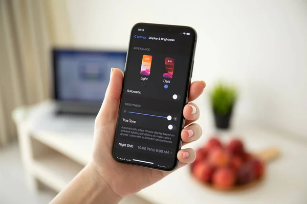
Conceptual material-and-choice model, not an iOS settings screenshot or a test of screen contrast, battery use or medical effects. Review the actual rendered interface separately.
Design for legibility and meaningful choices
Being attentive to user needs includes readable text, useful labels and controls that do not rely on color alone. Dark mode is not simply an inverted screenshot of a light design.
The W3C’s contrast guidance explains the WCAG requirement for text contrast and its exceptions. Check actual foreground/background combinations and text size; the overall darkness of a page does not establish accessibility.
On your own interface, test the theme choice, system preference, error states, focus indication and form controls. Preserve the content and function across themes. An external payment page or embedded service may render differently and needs its own review.
Test the outcome, not a health promise
The goal to prevent visual fatigue should not become a claim that one branded palette prevents discomfort for everyone. Ask whether people can read the content, distinguish the action and complete the task in their chosen environment.
If comparing creative, keep the offer and other conditions reasonably comparable. Inspect relevant actions, errors and feedback alongside engagement counts. Theme preference can be correlated with device or usage differences, so a simple comparison does not establish that dark mode caused a change.
Maintain assets that work in both contexts and respect the viewer’s choice. The practical benefit is a more usable presentation; engagement and business value still need evidence.
Meet the Author
Taji Yamada specializes in creating engaging content, managing social media platforms, analyzing data, and implementing effective campaigns to drive results. He is passionate about helping businesses increase their online presence and reach their target audience.


Leave a Reply